Khorshid Rayaneh
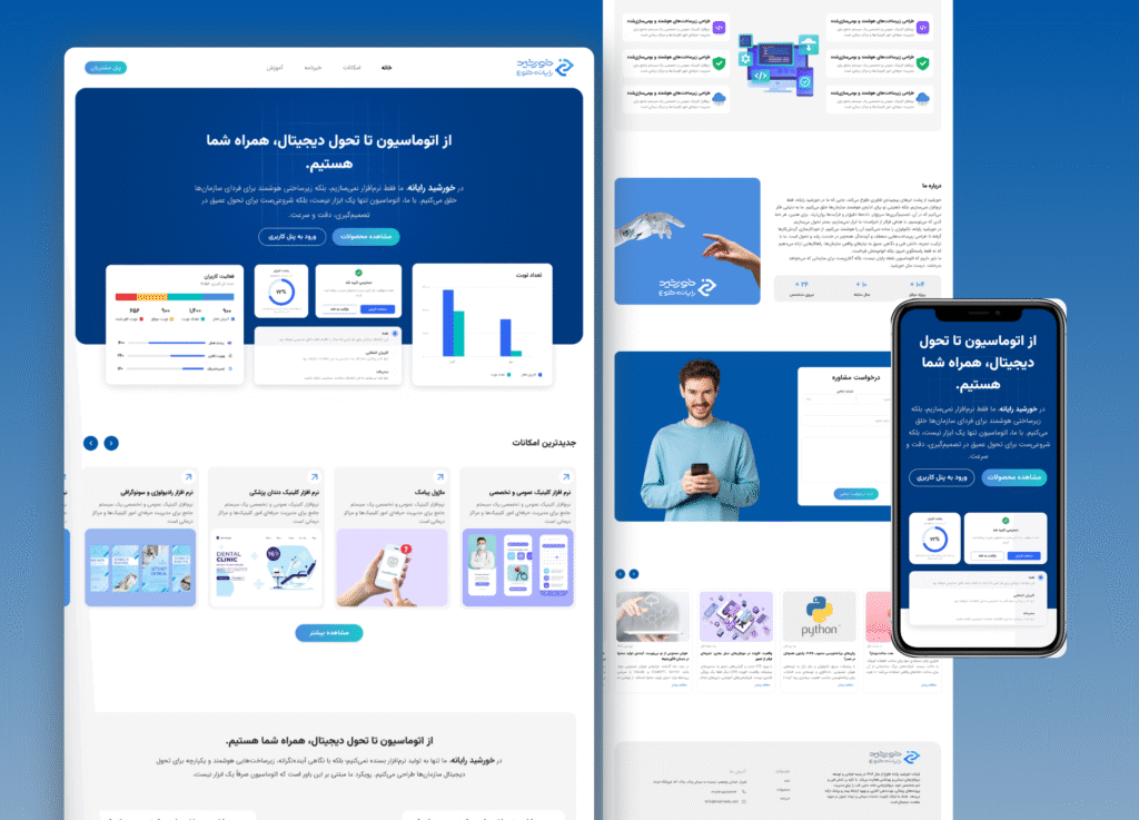
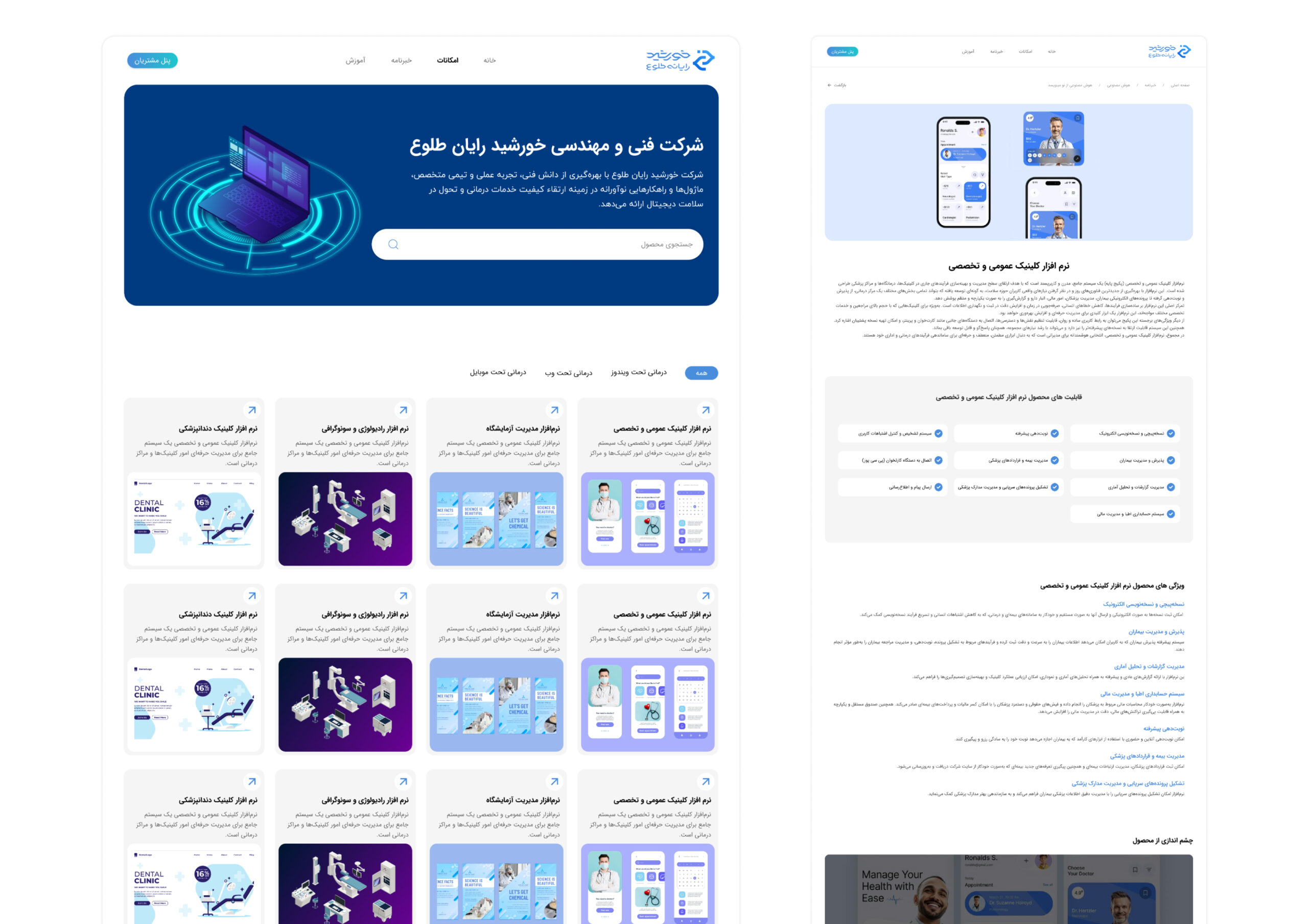
This project is a UI/UX design for a website of a company that develops medical software solutions. 
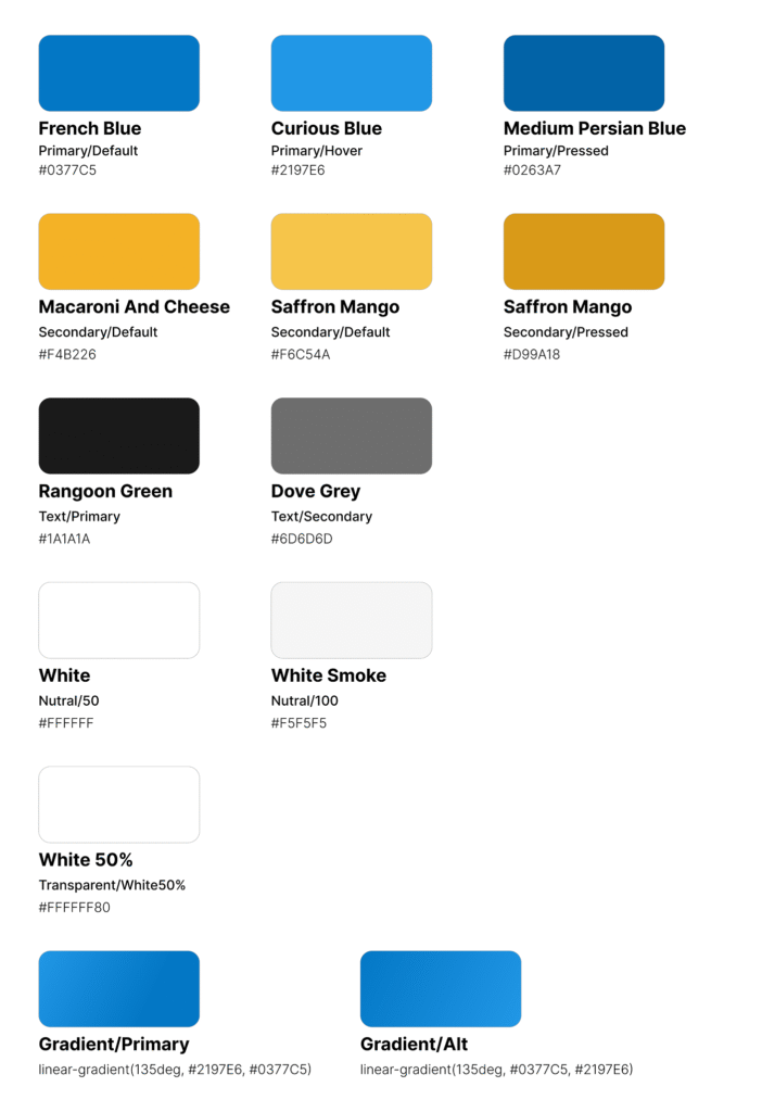
The goal was to create a clean, professional, and user-friendly interface that effectively presents complex healthcare products in a simple way. 
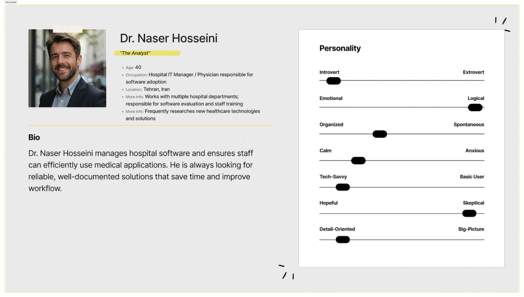
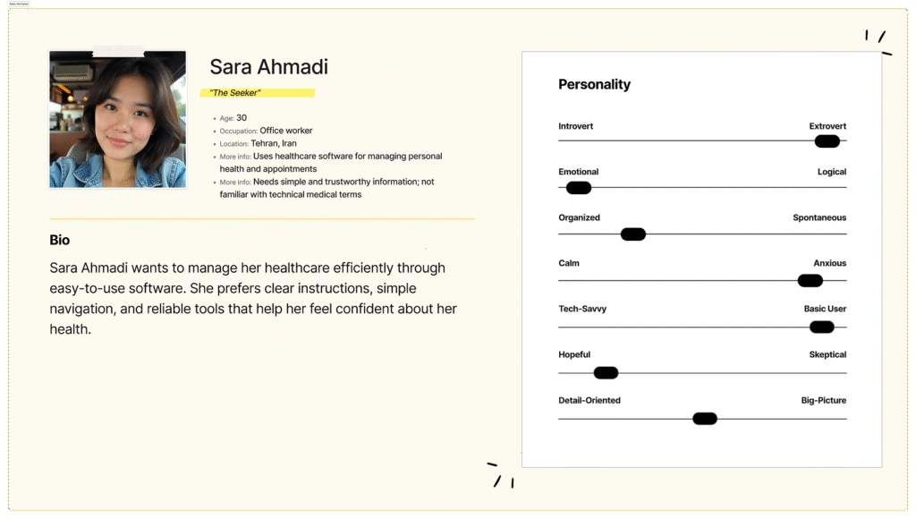
The design process included user research, wireframing, and prototyping, focusing on usability and clear navigation. The final design is responsive, accessible, and includes product demos, case studies, and contact sections to enhance engagement and trust among healthcare professionals.
Design Process
Research & Understanding
I began by exploring how the target users from hospital managers and healthcare IT teams to patients search for and interact with medical software. By analyzing competitor websites and user feedback I identified what works well and where improvements are needed. This process highlighted the importance of clarity, trust, and ease of use for all users. The website was designed to be simple, reliable, and user-friendly, providing a smooth and confident experience for accessing medical software.
Persona & Ideation
After gathering insights, I created two main personas: one representing healthcare professionals such as hospital managers and IT teams, and another representing patients who will use the software. These personas helped me understand each group’s specific needs. For example, making it easy for professionals to find detailed software information quickly, and ensuring that patients can navigate the website effortlessly to access the tools and services that improve their healthcare experience.
Wireframing & UI Design
Next, I planned the user flow and sketched wireframes to ensure that pages and actions were easy to follow for both healthcare professionals and patients. When moving on to the visual design in Figma, I focused on creating a clean and professional look with a calm, medical-inspired color palette and clear typography, making the interface feel trustworthy, approachable, and easy to navigate.
Prototyping & Testing
I created an interactive prototype and had both healthcare professionals and patients try it out. Their feedback highlighted areas where users could get confused or encounter difficulties, so I made adjustments such as simplifying navigation, clarifying key information, and refining the visual hierarchy to make the website easier, more intuitive, and comfortable to use.
Design Elements
Persona
Color Pallet
Typography
Final Ui Pages
Landing Page
other pages